
We’re three months into publishing The RISK Rituals newsletter, and I think we’re making great progress. This newsletter is dedicated to a new understanding of the digital reality we’re all increasingly living in. We gain that understanding by looking at this new reality through the lens of risk.
Yes, our newsletter is also about learning to be a better investor, but in today’s world we invest more than our capital. We invest our attention. Robinhood (HOOD) did indeed tell one truth in its recent S-1 filing – we’re all investors now.
We can’t understand what we can’t see, however. In the three months that we’ve been publishing The RISK Rituals, there’s one tool that has emerged that is really helping us to see the data that drives our digital lives in a new way. I’m talking about the humble histogram.
And, I’m particularly excited today to be able to share with you a glimpse into some new tools we’ve been developing over at our technology company, RiskSmith. Be sure to read all the way to the end so you don’t miss it!
We leaned heavily on histograms in our last issue of The RISK Rituals, for example, where we looked at the patterns of price changes that are most profitable for Robinhood. We saw something shocking in how polarized these patterns are. It allowed us to see that Robinhood, like other social media driven enterprises, has figured out a way to profit from polarization.
Once you have a business model that profits from polarization, it’s a small step to decide to “not resist” polarization. Should anyone be surprised that early trading patterns in HOOD look a lot like the same patterns we see in GameStop and Dogecoin? Don’t be fooled by the swirling controversies around HOOD. Polarization is part of its business strategy.
I am really encouraged by what we’ve been able to see and understand from using histograms. I believe that, through the lens of histograms, we are beginning to see something that I would call the shape of risk.
To be able to see these risk shapes is incredibly important and valuable because if there is one thing I’ve learned from a quarter century in the markets, it’s that the real rub for most of us is that we can’t psychologically process most of the risk shapes that the markets serve us up.
Moreover, these psychologically foreign risk shapes are sometimes weaponized against us to knock us off balance through things like FOMO and YOLO, so as to part fools from their money. And as I said earlier, this isn’t just about our “play” money any longer. It’s much higher stakes than that.
That’s why I’ve decided to dedicate this issue of The RISK Rituals to better understanding histograms. Let’s make sure that we really understand what we’re looking at in a histogram, and then let’s see what it is that makes them such a powerful tool for seeing our world in a whole new way.
Once you really understand how to look at these histograms and what it is they’re showing us, I believe that, like me, you will want to see more and more of them.
Before we dive in, just let me say that I get it that there’s a little heavy lifting here to start to see things in a new way, and I know that we’re all busy. All I can tell you is that after 25 years in the markets, these have been absolutely game-changing for me. I know that they will be for you, too.
Understanding Histograms
When it comes to markets, we are used to looking at data as it unfolds over time. If we look at a chart of Bitcoin, for example, over the past year, it looks like this:
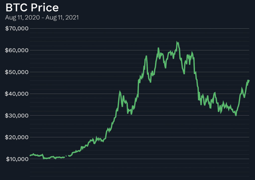
Looking at the data in this way draws our attention to prices. We automatically start to look for what the price was a year ago and what it is today. Right? We look for what the high price was, and if you’re like me, you might start to wonder if today’s price is a “bargain” relative to the recent high prices. Maybe a good spot to “get in.”
Do you see what’s happening? The mind is taking us to imaginary and, I believe, unproductive places. I stand by my position that for the most part, price is a hallucinogenic drug. Histograms, as we shall see, don’t lend themselves to dreamy ruminations on possible price patterns.
Our first step towards understanding histograms is to stop looking at prices (e.g., $40,000) and start looking at price changes (e.g., down 4.2% from yesterday). Let’s first look at Bitcoin’s price changes over the past year. This is a chart of how much Bitcoin has changed from one day to the next in percentage terms. You can see that one day in February 2021, Bitcoin was up nearly 20% from the previous day.
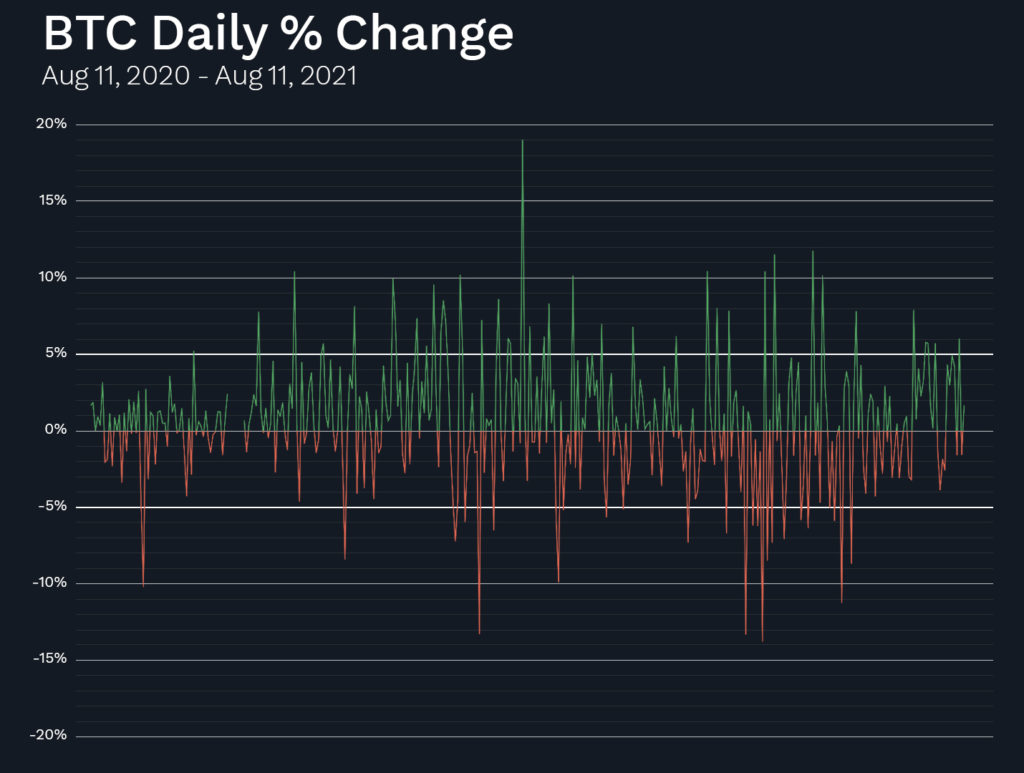
If we focus on 5% and -5% horizontal lines in the chart above, we see that there were many days over the past year where BTC was up or down by more than 5% from the prior day.
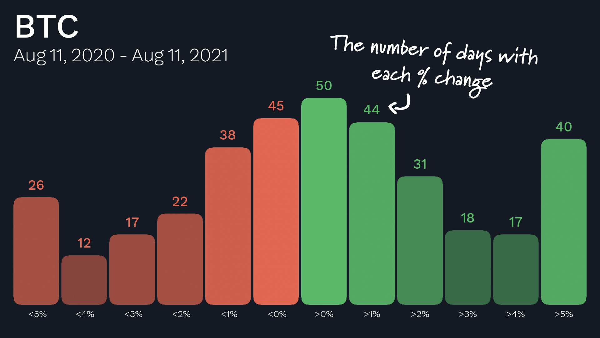
Now let’s take the final step to create a histogram. Instead of looking at these price changes in Bitcoin from one day to the next, we can count how many times Bitcoin’s price changes fell into different price change buckets.

In this histogram each bucket is 1%. The first green bucket in the middle is the plus 0% to 1% daily gain bucket. We can see that over the past year the daily percentage change in the price of BTC was between 0% and +1% about 50 times. The first red bucket in the middle is how many days BTC was down between 0% and -1% from the previous day.
The two bars on the end are the “overflow” buckets. The left bucket is the number of times BTC was down by 5% or more on a given day, and the right bucket is the number of times it was up by 5% or more on a given day.
For the sake of comparison, let’s now look at the same charts for the S&P 500. We’ll start with the daily closing prices of the S&P 500. Like BTC, it’s been a good year for the S&P 500 – up and to the right.
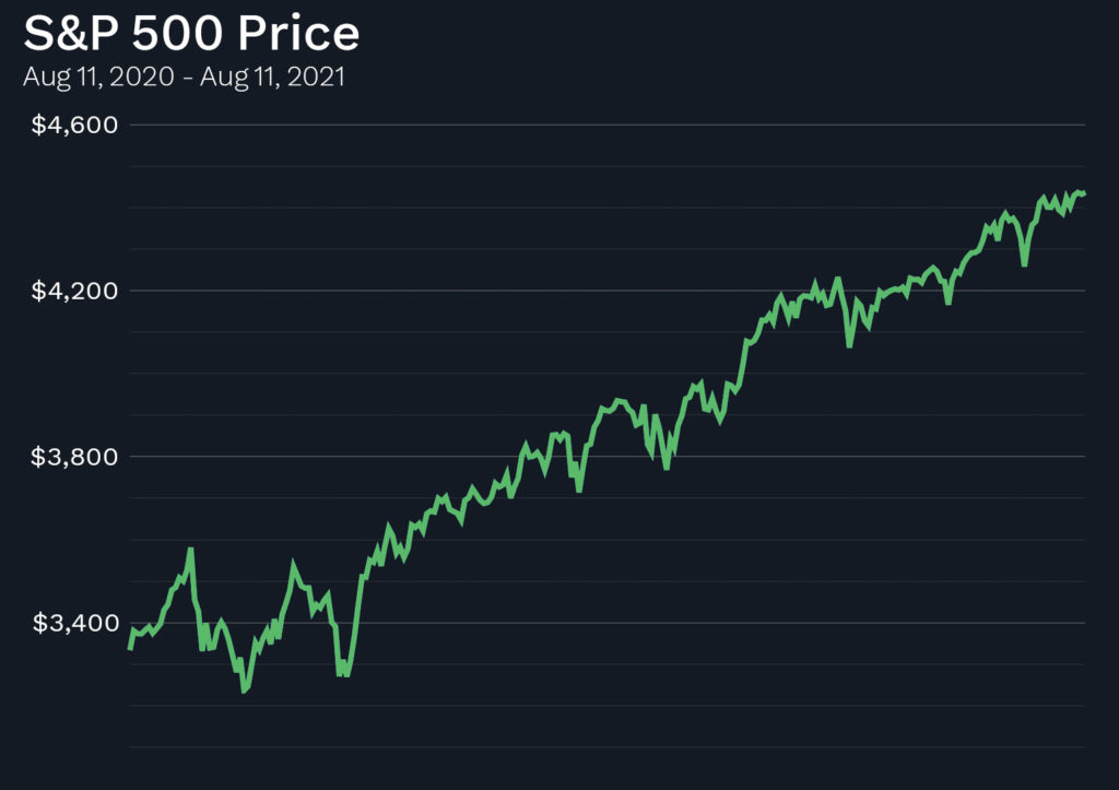
For the sake of comparison, let’s now look at the same charts for the S&P 500. We’ll start with the daily closing prices of the S&P 500. Like BTC, it’s been a good year for the S&P 500 – up and to the right.
But when we look at the percentage changes from day to day in the S&P 500, we can see that, unlike BTC, there are zero days where the daily change was plus or minus 5% or more. In fact, it was rare to see the S&P 500 change by even 2% in a day over the past year (compare that to BTC, in the background in the chart below).
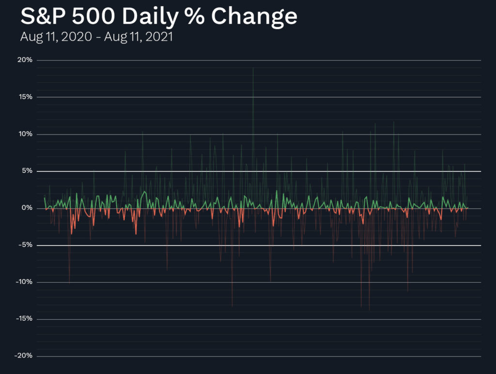
When we now “collapse time” by putting this S&P 500 percentage change data into a histogram, you can see how the data bunches up much more in the middle vs. how the data is more spread out for BTC (which, again, is shown behind the S&P 500 data in the chart below).
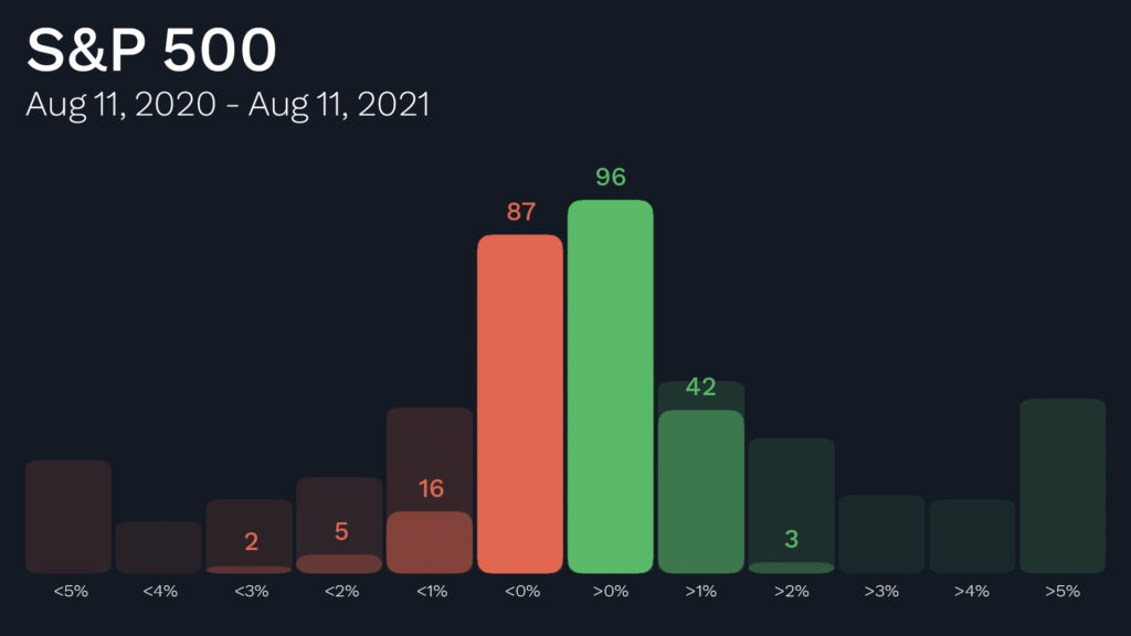
It looks much different than the same histogram for BTC. Right?
OK. So now you know what histograms are and how they are put together. Great job! Believe me, you are way ahead of the curve. You know something now that the vast majority of other capitalists do not know. I’m excited to share more with you about what these histograms can really do for us.
In the meantime, as promised above, our RiskSmith team has built a page for you to browse some more histograms. Try to look at them without jumping to any quick conclusions. I’d love to know what you see. (And make sure to get on the RiskSmith waitlist while you’re there!) In the next issue I’ll tell you what I see.